Project 1 - Hotel Morpheus
Mobile game environment - 6 week project
The Art Bible
Beginning any project can be a daunting task. For Hotel Morpheus, we were given free reign in terms of our environment idea as long as there were transitions of space within my environment such as a hallway/corridor leading into a room. To help me, I created an Art Bible which is essentially images that illustrate my vision as well as build upon and backs up my ideas. It is also used to show other people in the team the visual design and themes of the game idea.
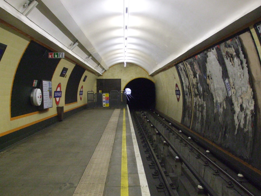
My chosen idea was to have a typical hotel hallway leading into an abandoned train carriage and underground tube station. I created a fictional tube station based on where I lived-West Norwood. Closed during the 1990s due to an accident which caused the area to collapse. I think this would be an interesting space to show players. I can add posters and interesting objects found during that time such as the train. I can also show the decay and wear of the environment.
Below is a slide show of my Art Bible. I used images from the film Skyfall-007 along with other films to help illustrate the lighting in different spaces. Throughout this process, I will be taking a lot of photographs from different tube stations to better my understanding of the scale, objects and layout as well as finding potential textures to use for my project.
Beginning any project can be a daunting task. For Hotel Morpheus, we were given free reign in terms of our environment idea as long as there were transitions of space within my environment such as a hallway/corridor leading into a room. To help me, I created an Art Bible which is essentially images that illustrate my vision as well as build upon and backs up my ideas. It is also used to show other people in the team the visual design and themes of the game idea.
My chosen idea was to have a typical hotel hallway leading into an abandoned train carriage and underground tube station. I created a fictional tube station based on where I lived-West Norwood. Closed during the 1990s due to an accident which caused the area to collapse. I think this would be an interesting space to show players. I can add posters and interesting objects found during that time such as the train. I can also show the decay and wear of the environment.
Below is a slide show of my Art Bible. I used images from the film Skyfall-007 along with other films to help illustrate the lighting in different spaces. Throughout this process, I will be taking a lot of photographs from different tube stations to better my understanding of the scale, objects and layout as well as finding potential textures to use for my project.
Feedback
I received some feedback from Simon-my tutor- and decided to tone down the scale of my idea. Maybe modelling the train may be too ambitious in due to the time I have. The platform is in itself a very long corridor so Simon advised I focused on the underground station itself and think about modularity when modelling.
The textures in my Art Bible were too small, I should provide larger images so I know what the overall shape and material is in relation to the train platform. I should also look more into lighting and finding ways in which to make it interesting for the player. Maybe even include a flashlight for the player to hold.
If I had time afterwards, I can maybe incorporate a train or the front view of a train in the background. I can also create a stairwell leading to other areas and rooms. But for now, my main priority is to block out my level to see how big my scene will be and how I can manage my time effectively.
Starting my modelling
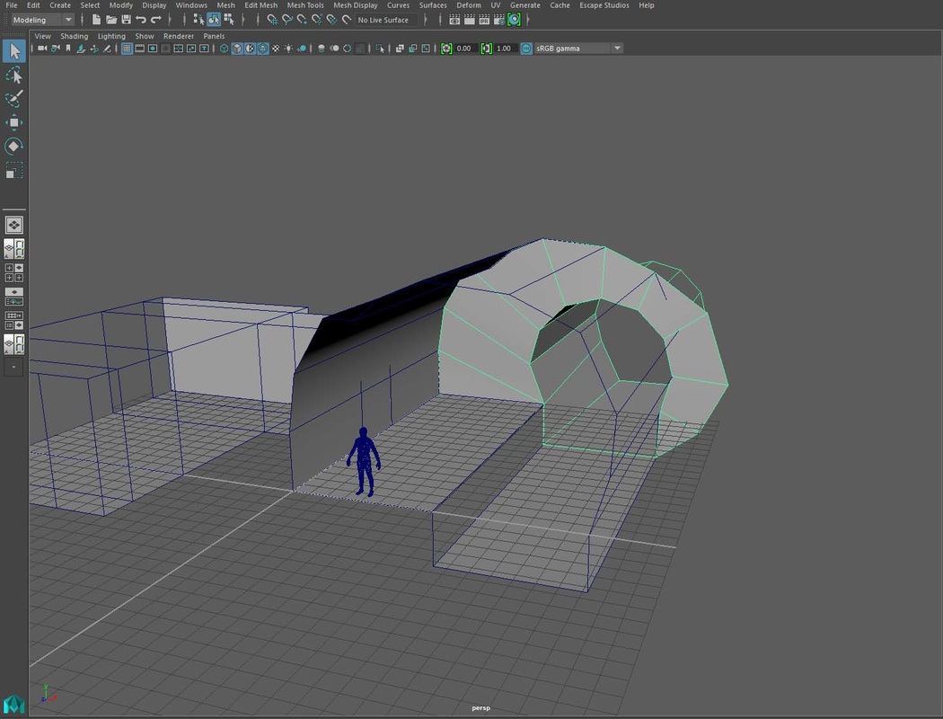
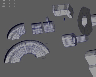
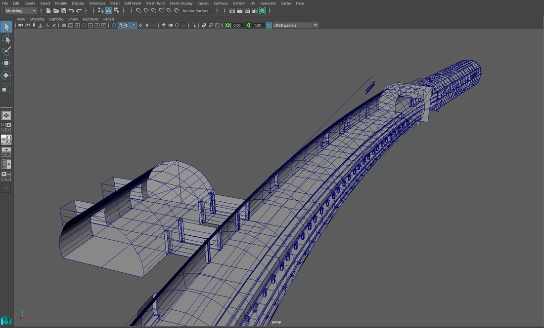
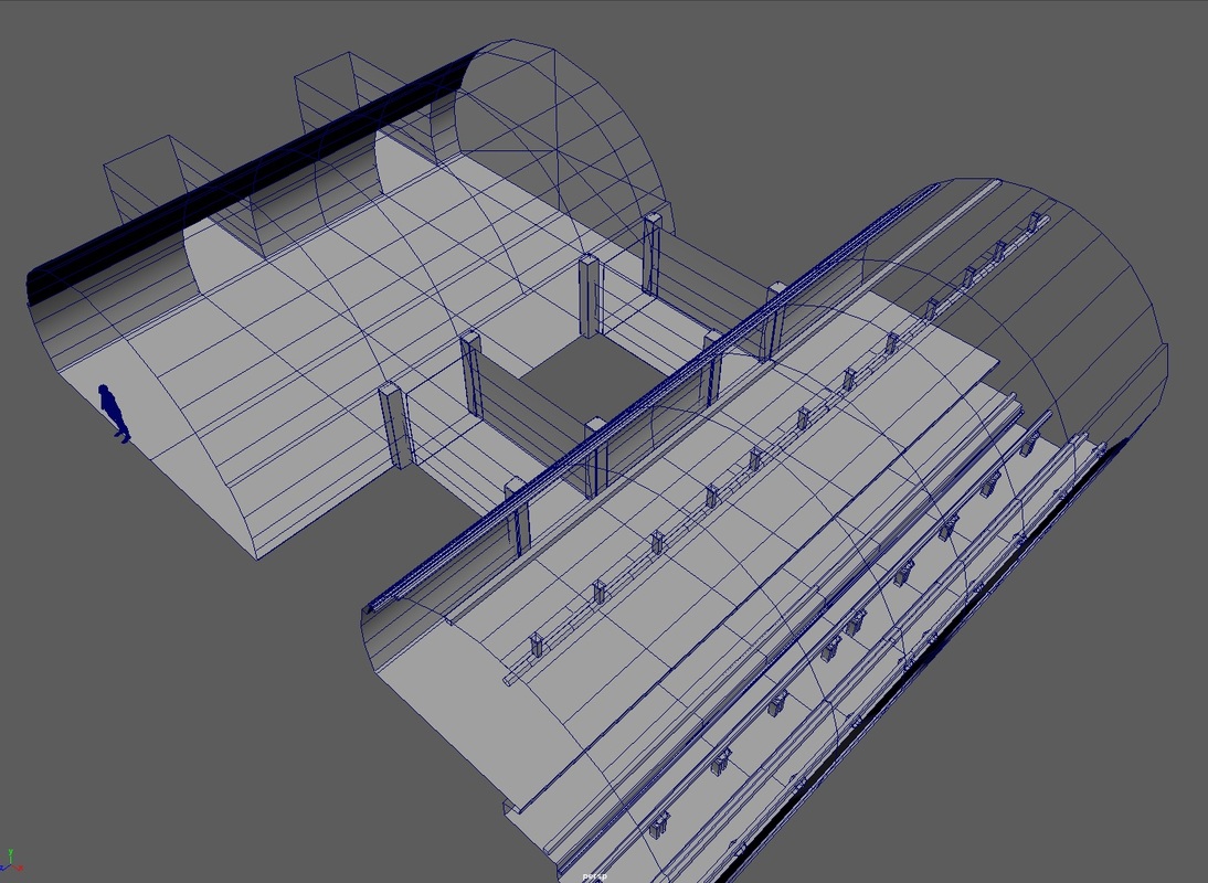
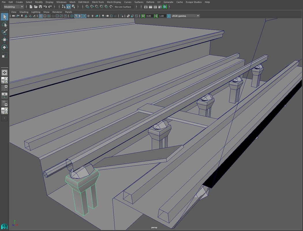
I knew I had to find an efficient way of modelling-especially for mobile. I decided to split my environment into different pieces to make it easier to render my scene as well as making it easier for me to make any adjustments. I modelled small chunks for my platform and then piece them all together to form a whole. This doesn't need to be in detail as I just want to convey the general form of the objects. I separate my pieces into the wall, ceiling, floor, tracks and light. The wall will also have 4 variants to create variety. A standard wall, a wall with a bench, a wall with a door and lastly a wall with an archway and a small passageway leading to a room.
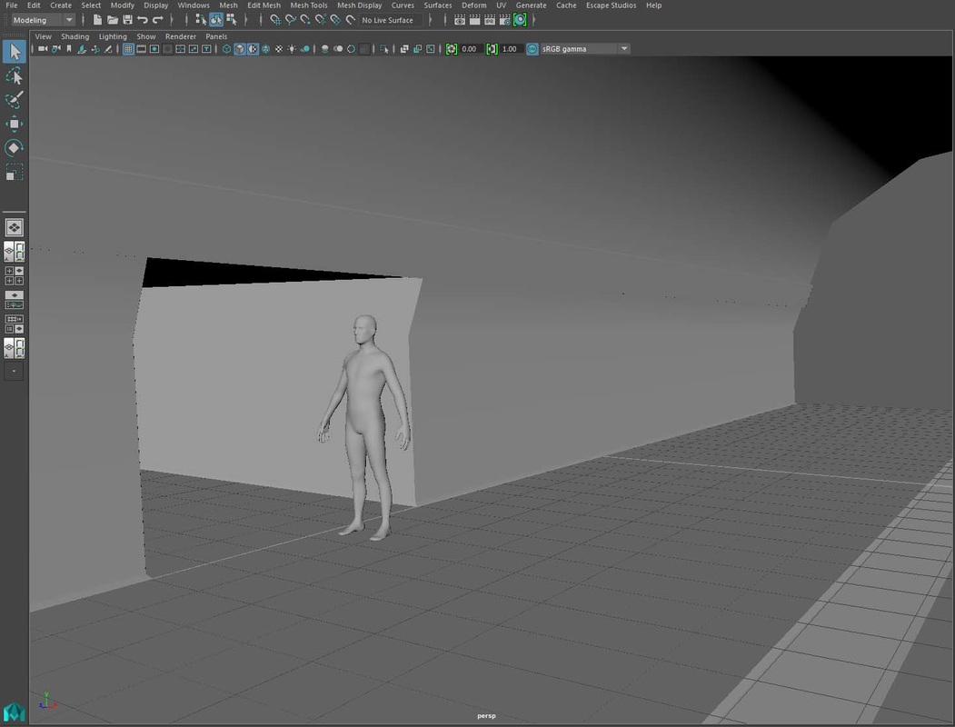
I used a human model in Maya to ensure my models are to scale. It is very important to get the proportions right to make the scene believable. In order to achieve this, I got lots of primary and secondary photos to use as a reference and blocked out the scene with shapes. I used cylinders for the tube interior and inverted the faces. I also moved the sides to form the platform. Any faces that aren't visible to the player should be removed as they are extra geometry.
I knew I had to find an efficient way of modelling-especially for mobile. I decided to split my environment into different pieces to make it easier to render my scene as well as making it easier for me to make any adjustments. I modelled small chunks for my platform and then piece them all together to form a whole. This doesn't need to be in detail as I just want to convey the general form of the objects. I separate my pieces into the wall, ceiling, floor, tracks and light. The wall will also have 4 variants to create variety. A standard wall, a wall with a bench, a wall with a door and lastly a wall with an archway and a small passageway leading to a room.
I used a human model in Maya to ensure my models are to scale. It is very important to get the proportions right to make the scene believable. In order to achieve this, I got lots of primary and secondary photos to use as a reference and blocked out the scene with shapes. I used cylinders for the tube interior and inverted the faces. I also moved the sides to form the platform. Any faces that aren't visible to the player should be removed as they are extra geometry.
I asked Simon for some feedback on my models. It would be nice to include some curvature. Looking at my references, I did see there were some curvature on some of the stations. Also, some of my pieces could do with more segments so I redone them to give it a smoother shape and added a bevel to avoid shimmering that occurs on sharp edges.
During class, we looked at in-game models for Republique and Infinity Blade and I realised I could afford to use more geometry in my models without it affecting performance. I need to get used to knowing my limits and what I can still add to my environment at this stage.
I added a slight curve using the bend deformer to my models and I found that it was much harder to model and edit them. I will add this last once I am happy to export to Unity. I also found out that if I duplicate the deformed model, it will keep its current shape and remove its history with the initial bend curve.
I took a front view photo of the bench and imported it into Maya to help me get the scale right. I also did the same for the platform. By the end of the day, I had managed to model my first chunk including the tracks and lights.
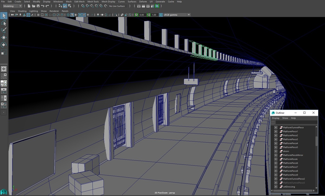
I try to keep my workspace clean and organised. To do this I named all my meshes as well as grouped some together. It made me work faster and more efficiently as I create my entire environment in one scene. I also used the display window to create layers where I can easily hide and show different objects. This allowed me to work within the grid lines. Modelling with the grid ensures each piece is of even length allowing me to snap them together uniformly.
I try to keep my workspace clean and organised. To do this I named all my meshes as well as grouped some together. It made me work faster and more efficiently as I create my entire environment in one scene. I also used the display window to create layers where I can easily hide and show different objects. This allowed me to work within the grid lines. Modelling with the grid ensures each piece is of even length allowing me to snap them together uniformly.
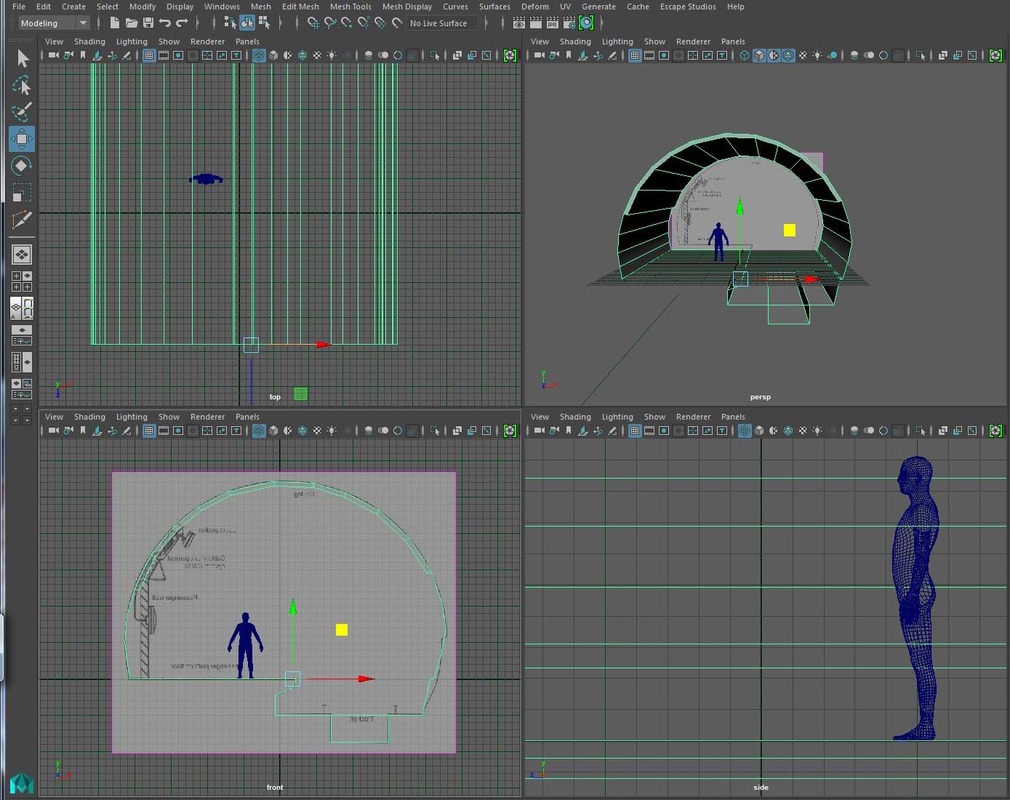
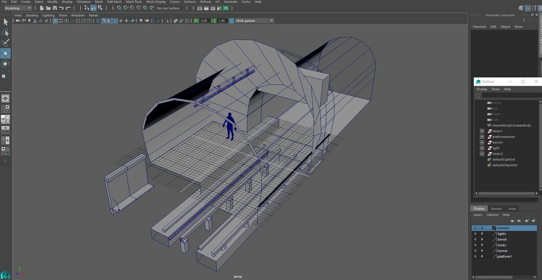
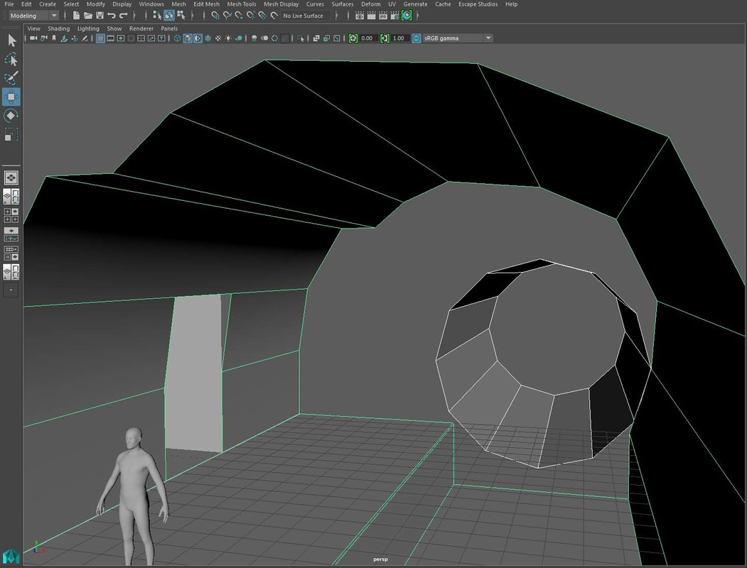
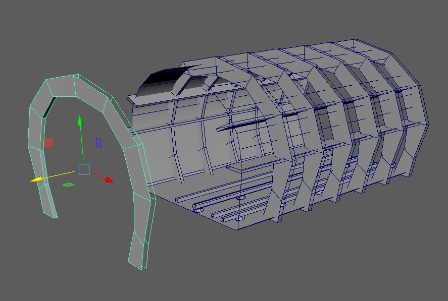
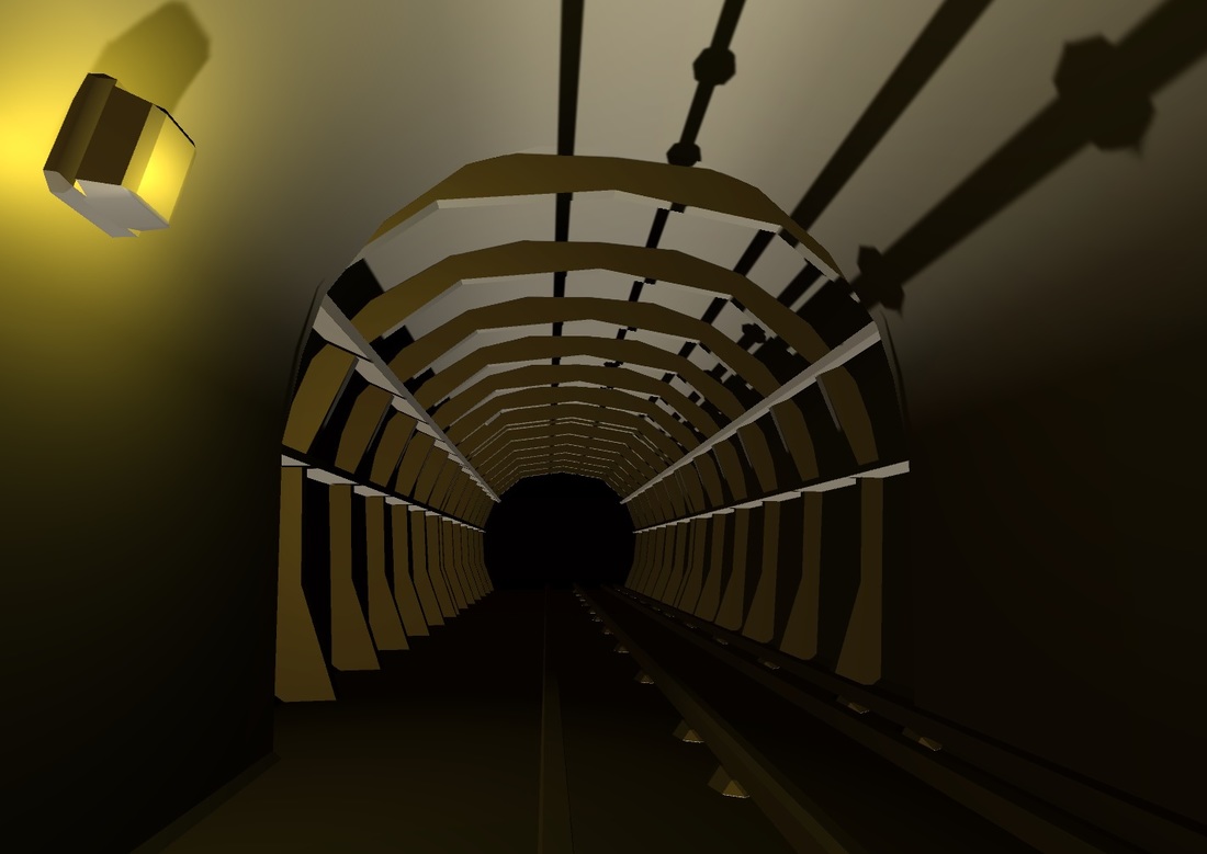
The tunnel section (2nd image below) was tricky as the structure of the inner ridges are quite polygon intensive. I really like how the ridges create this weird, alien-like space, at first I tried to model this in one mesh but later decided to create the small pieces for the ridges separately. I still need to find a way to block out the ends to stop the player from falling off the edge. Maybe some type of landslide or rocks. The player will start in the tunnel and will transition towards the platform area, eventually leading to the room which may or may not be accessible depending on the time.
UVing and Unity
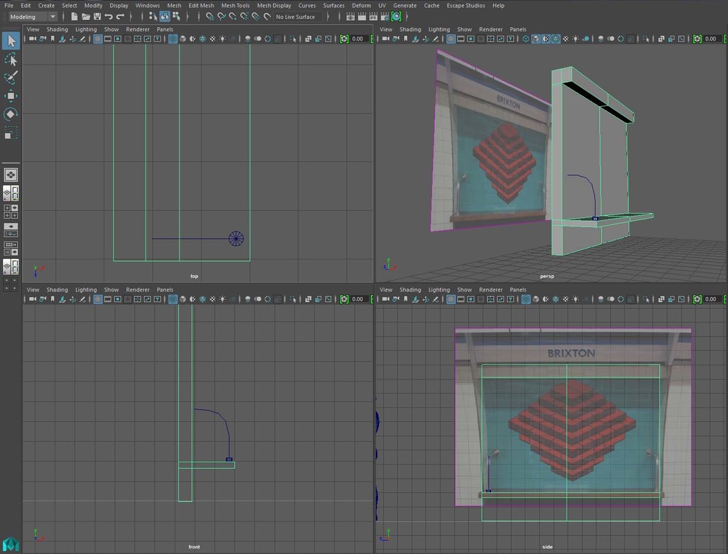
We used Unity as our engine so all the models I created in Maya were exported to Unity. I used Unitys first person controller to allow the player to walk and look around in my environment. There are a few important points I need to remember when exporting objects out of Maya. Unitys first person controller is of a certain size so to avoid any scaling issues it is best to model in the right metric system. Also, it is important to delete history, freeze transformations and to place the pivot point in the right place on the models to ensure exporting goes smoothly.
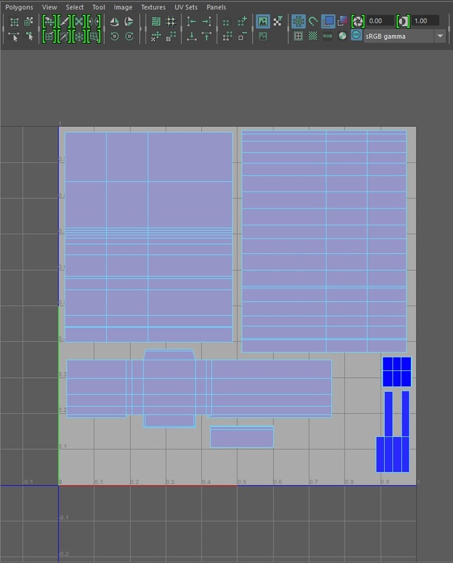
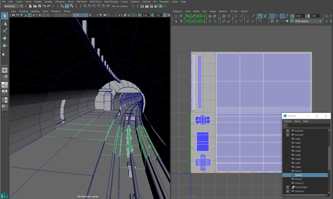
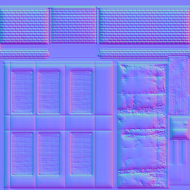
I made a number of mistakes during the UV step. In hindsight, I should've adjusted the UV space on my first piece so when I duplicate the mesh, it would make a copy of the previous UV position. However, this was easily corrected as my pieces where modular so replacing the section didn't take too long. The main mistake I done was not using up the UV map space efficiently. In the first image, I put the entire piece into one UV map. Floor, wall, ceiling and lights. The texel density for each part is uneven. The UVs on the walls were also a different size so when I exported the mesh to Unity to test, the texture was inconsistent along the platform.
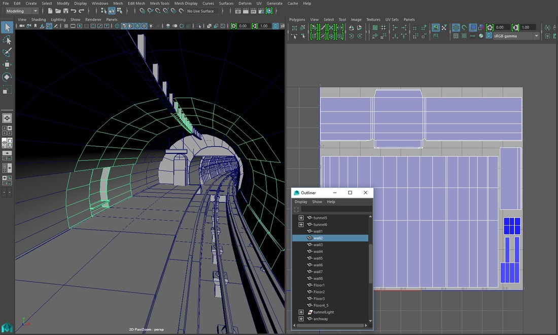
In the second image, I thought it was a good idea to separate all my walls into its own UV map to save space and ensure the sizes match. Turns out that this is inefficient when it comes to introducing the occlusion culling technique which hides objects when the player camera is not looking at it. This is used to free up memory rendering objects when it is not needed and would improve framerate and overall efficiency. For occlusion culling to work better, it is advised to have the parts in the same UV map. This is so when it is assigned into a material in Unity, the culling technique would work better.
We used Unity as our engine so all the models I created in Maya were exported to Unity. I used Unitys first person controller to allow the player to walk and look around in my environment. There are a few important points I need to remember when exporting objects out of Maya. Unitys first person controller is of a certain size so to avoid any scaling issues it is best to model in the right metric system. Also, it is important to delete history, freeze transformations and to place the pivot point in the right place on the models to ensure exporting goes smoothly.
I made a number of mistakes during the UV step. In hindsight, I should've adjusted the UV space on my first piece so when I duplicate the mesh, it would make a copy of the previous UV position. However, this was easily corrected as my pieces where modular so replacing the section didn't take too long. The main mistake I done was not using up the UV map space efficiently. In the first image, I put the entire piece into one UV map. Floor, wall, ceiling and lights. The texel density for each part is uneven. The UVs on the walls were also a different size so when I exported the mesh to Unity to test, the texture was inconsistent along the platform.
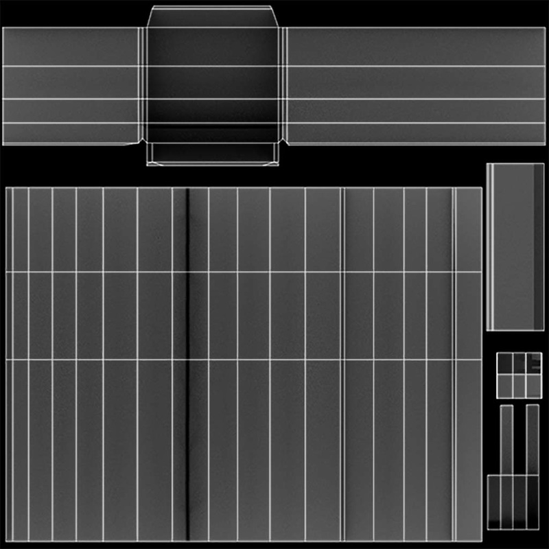
In the second image, I thought it was a good idea to separate all my walls into its own UV map to save space and ensure the sizes match. Turns out that this is inefficient when it comes to introducing the occlusion culling technique which hides objects when the player camera is not looking at it. This is used to free up memory rendering objects when it is not needed and would improve framerate and overall efficiency. For occlusion culling to work better, it is advised to have the parts in the same UV map. This is so when it is assigned into a material in Unity, the culling technique would work better.
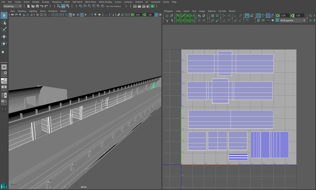
I spoke to Simon about this to see what is the best approach to take with this. Simon suggested there is no right or wrong answer to this. I could split the piece into two UV maps. The floor and the tracks as one material and the walls, ceiling and lights in another. Due to my platform having multiple types of wall pieces, I decided to reduce it to just the standard wall, wall with the seat and the wall with the two passageways. With two more weeks till the deadline, I was beginning to feel the pressure of my workload. I also decided to reduce the length of my platform so I could focus on adding decals and prioritising my efforts in a smaller space. The image below shows the way I separated my UV maps in Maya. The extra UV space allowed me to increase the shell size for the wall which will in turn make it easier to texture and at a higher resolution. I ensured the wall is roughly the same size as my other walls to allow the texture to tile.
Texturing and materials
I want to put a lot of emphasis on decals and showing dirt and wear in my environment. There are lots of images of actual abandoned stations dotted all around London such as Aldwych station and was perfect research material for me when creating my Art Bible. Also the fact that I had access to London Tube stations helped too as I took lots of photographs which I used to make my environment more believable.
I want to put a lot of emphasis on decals and showing dirt and wear in my environment. There are lots of images of actual abandoned stations dotted all around London such as Aldwych station and was perfect research material for me when creating my Art Bible. Also the fact that I had access to London Tube stations helped too as I took lots of photographs which I used to make my environment more believable.
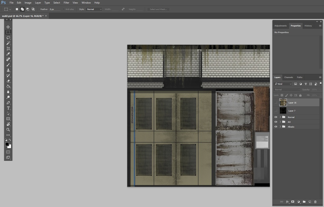
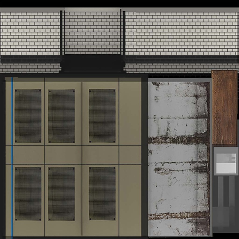
I did spend a lot of time going back and forth between Photoshop and Unity, mainly due to the tiling issues I was having with the walls and floor when packing my UVs, I tried to ensure the size and texel density of the walls are as even as possible but even then, they were not aligned perfectly. There are other factors as well such as the texture size and geometry spacing which would affect the final picture. I created all my maps in 1024x1024 initially then changed the image size to 512x512 for my final version. I noticed some images became very pixelated due to me scaling it up to match the UVs. I kept the wall texture 1024x1024 image resolution.
I also added ambient occlusion for all my objects to give it extra realism and depth as it shows how the light and environment affects the surface of the object. This was created using the mentalray plugin in Maya and the image was added as a separate multiply layer with the albedo in Photoshop.
I also added ambient occlusion for all my objects to give it extra realism and depth as it shows how the light and environment affects the surface of the object. This was created using the mentalray plugin in Maya and the image was added as a separate multiply layer with the albedo in Photoshop.
|
|
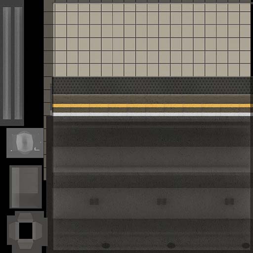
The floor texture on the left is used for the entire platform. At first I wanted to create multiple floor texture maps but I figured it would save me a lot more time if I just used the one material and made sure it tiled.
I decided to also put the dirt layer as part of the albedo. The first image on the left is left clean for the normal map. To create my normal maps I used Ndo - Quixel Suite. The Photoshop plugin is easy to use as well as provide a variety of parameters and presets to choose from. |

Lighting and finishing touches
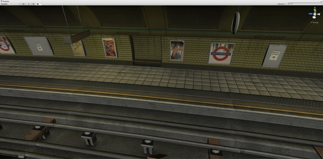
I did not expect lighting to take so long and it took me around two days before I could find a balance I was happy with. In the final build, I decided to reduce the intensity of some of my point lights to make the overall scene darker than I originally wanted from my reference images. I felt this improved the overall tone and mood of the scene I wanted to portray.
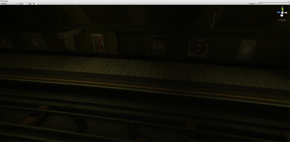
I used lighting to guide the player forward and to show the different transitions between areas as stated in the project brief. The player spawns in the tunnel area with patches of orange lights. In the distance the player will see some lights from an object in the distance and as they move closer, the lighting changes from the warm orange to a cold yellow hue. The tube lights above are dimly lit due to the years of neglect. This adds a stronger sense of believability to the scene.
Transferring the scene to tablet was relatively straight forward, I removed the bloom effect as it was reducing my frame rate to 16-18 fps. Now it sits between 50-60fps which is great.
I noticed the normal map in the scene weren't as strong as I hoped and it made the scene look very flat-especially the floor. I increased the strength of the normal map. Without the lights in Unity, it looks very rough and but with the lights turned on, it creates a milder effect. I didn't want the wall and floor tiles to be too shiny due to the type of environment I am making so it is important to find the right balance of roughness.
I did not expect lighting to take so long and it took me around two days before I could find a balance I was happy with. In the final build, I decided to reduce the intensity of some of my point lights to make the overall scene darker than I originally wanted from my reference images. I felt this improved the overall tone and mood of the scene I wanted to portray.
I used lighting to guide the player forward and to show the different transitions between areas as stated in the project brief. The player spawns in the tunnel area with patches of orange lights. In the distance the player will see some lights from an object in the distance and as they move closer, the lighting changes from the warm orange to a cold yellow hue. The tube lights above are dimly lit due to the years of neglect. This adds a stronger sense of believability to the scene.
Transferring the scene to tablet was relatively straight forward, I removed the bloom effect as it was reducing my frame rate to 16-18 fps. Now it sits between 50-60fps which is great.
I noticed the normal map in the scene weren't as strong as I hoped and it made the scene look very flat-especially the floor. I increased the strength of the normal map. Without the lights in Unity, it looks very rough and but with the lights turned on, it creates a milder effect. I didn't want the wall and floor tiles to be too shiny due to the type of environment I am making so it is important to find the right balance of roughness.
Presentation and feedback
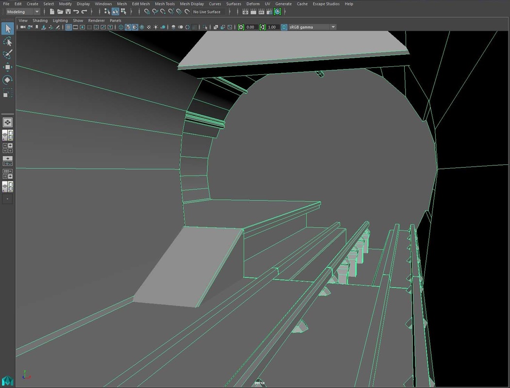
On the final week, I presented my Art Bible and environment to the class. Overall it was well received, Simon suggested some things I can change for the final submission. The geometry for the tunnel section looked too edgy so I added addition sides as well as bevel all the edges to give it a more rounded look-it turned out really well. Another issue was how some of my textures were too blurry compared to others which caused a visual disparity to the scene. I did what I can to remedy this but the resolution of my images were low to begin with so all I could do was increase the file size back to 1024 x 1024 in hopes that it would look clearer than before. I should've found higher resolution images instead of using some of the images taken from my phone.
Overall, the feedback was positive and people liked my use of lighting and the details on the walls. The train with the lights in the background was a good addition to the scene.
|
|
The first image on the left was my initial version for the track section and on the right is the final version I revised after the feedback. A huge improvement and looks much closer to my reference image.
|

With the 6 weeks over. Below is the revised version of my Art Bible. I added additions images and photographs I took as well as reference images used. My original vision still remained the same, to create an abandoned tube station and to pay close attention to lighting, proportion and the wear of materials. Hopefully that shows through in my final scene.
Final thoughts (Conclusion)
This process has been an eye opener for me. I have learnt so many things and made a number of mistakes which hopefully I will learn to avoid for my future projects. Overall, I liked how my environment turned out and I feel I have achieved what I wanted to when I started planning my Art Bible which was to create an interesting place that showed the damage and years of neglect as well as providing an interesting journey for the player through lighting especially.
A project is never complete and there are always things for me to refine, improve on and add if given more time. My time management was fine but the final week felt like a rush to get things completed such as the normal maps and baking the lightmaps in Unity. I did anticipate that I would encounter issues and also due to learning new software, I didn't have the experience to gauge how long each step took. If I had more time, I would like to spend more time finding better quality textures and learning to better optimise my maps to achieve a better result. I would also like to re-model my set dressing objects and the rocks as it feels too simple and could do with more geometry. I've come to realise the significance of planning and how it affects from one stage to another. Making sure my models take into account occlusion culling and the UVs are packed efficiently for texturing and even texel density to name a few.